Whistler Luxury
I developed the front end of the website for luxury Whistler real estate listings, it has elegant transitions for images and content to make it stand out like the listings itself.
I added custom Javascript code for the section scrolling on the homepage and the filters for the listing page.
Role
Front End Developer
Technologies
Javascript, CSS3 (SASS), HTML5, Grunt
Year
2016
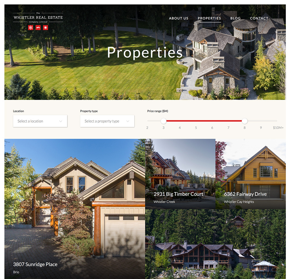
The filter for the listing page
The filter functionality and the grid for the filter needed some custom javascript, the plug-in NoUiSlider for the range slider and CSS for the layout and transitions.
A Code snipped to update after filtering
In this case I only had a few items that needed to be filtered and therefore there was no need for a JS framework.
I cached the items, wrote a filter and then replaced the ones on the page with the filtered result.
// remove current listings
self.container.innerHTML = "";

// create a "virtual" DOM node
var fragment = document.createDocumentFragment();

self.filteredElems.forEach((el) => {

    // it would be bad for performance to add them directly to the DOM
    // add to the document fragment
    fragment.appendChild(el.cloneNode(true));
});

// append all items at once for a good performance, DOM is only touched once
self.container.appendChild(fragment);
CSS for the listing page
The layout is quite complex and needed therefore different styles for the links and the ":last-of-type" attribute to change the layout in order to not create empty spaces.
// the CSS for the filtered layout
// floating links as squares with 1/4 of the width of the parent
a {
    float:left;
    height:0;
    width:25%;
    padding-bottom:25%;
    position:relative;
    overflow:hidden;
}

// first, 4th, 7th and so on are 1/2 half of the width
a:nth-child(3n+1) {
    width:50%;
    padding-bottom:50%;
}
// 5th, 6th, 11th, 12th,... need to be moved to stay inside the grid
a:nth-child(6n+5),
a:nth-child(6n+6) {
    margin-top:-25%;
}
// every 6th element need to be moved to the left
a:nth-child(6n+6) {
    margin-left:25%;
}

// there are cases where there aren't enough listings to fill the grid
// the following css will fix the empty spaces in the layout
a:nth-child(3n+2):last-of-type {
    width:50%;
    padding-bottom: 50%;
}
a:nth-child(6n+5):last-of-type {
    width:50%;
    padding-bottom:25%;
}
The flexibility of the layout
The layout of the listings changes not only based on your screen width but also based on the amount of elements, to not have empty spaces and always a clean design.